What were the pigments and colors used in hand-made or printed and color-enhanced 17th and 18th centuries maps?
There are many questions to be asked about the pigments which were used at that time:
- Do maps’ artists and colorists use the same pigments as painters?
- Were different pigments used depending on the type of maps, e.g. maps for the king or the nobility, maps of military campaigns, cadastres, etc.?
- Are they different depending on the scale and format of the maps? What about the color-enhanced printed maps inserted in books versus large wall maps and atlases? What about paper choices?
- Which pigments were used in the 16th, 17th, or 18th centuries? How did the pigment choices evolve over time, which ones ceased to be used, and which were the new pigments?
- Were the pigments different depending on the region? Which pigments were used in Europe, America, or Asia?
- What mineral or organic pigments are used? This choice may explain why the colors of certain maps have faded.
- Why was gold used so often on maps of the XVII-XVIII centuries?
- What are the symbolisms of the different colors?
- And finally, are the colors that we see today on the maps of this period the original colors, or have they changed or faded over time? Were these seas of green color actually blue? Were these blue mountains green? Were these black areas originally yellow?
To answer these questions, we can read various texts of this period, in particular instruction manuals of colorists. Experts can also analyze the maps themselves.
Cartographers’ and Painters’ Pigments
There are few studies on colors in cartography and even fewer on the pigments used.
Can we learn more about the pigments used by cartographers by studying the pigments of painters? Are they the same?
This is an important question. Indeed, much is written on pigments used by 17th and 18th centuries painters. That can give us some clues as to the pigments used, but we cannot affirm that the same pigments were used in cartography.
In fact, cartography is considered a minor art whose function is mainly utilitarian. And the addition of colors or illumination is valued even less than engraving. Thus the engineer Hubert Gautier, in his treatise on the art of wash drawing (1687) expresses his disdain for illumination by saying that “… ladies and nuns can easily occupy themselves with this sort of exercise”. It is no coincidence that maps are found in libraries and not in museums.
And so, it is conceivable that cartographers most often use cheaper pigments than those used by painters, except in maps and plans for royalty or nobility. And that their palette is more limited.
For military maps, we know what these pigments were. The 18th-century treatises detail their list. They are selected for their price, their transparency, their ease of use and transport, and their light fastness. John Muller’s book A treatise containing the elementary part of fortification (1746) gives us the pigment list: India ink (not really a pigment), carmine, gamboge, indigo, verdigris, sap green and umber. In the next century, the Manuel du coloriste (1834) also imposed a limit to the number of pigments to be used in cartography.
Pigments Over the Centuries
I propose to develop a table of pigments by century, following my readings.
Pigments According to the Type of Maps
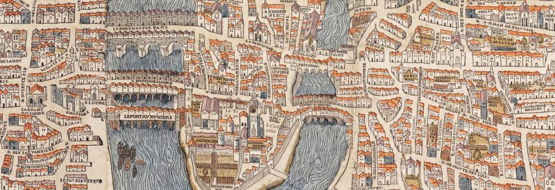
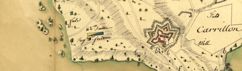
Let’s take a look at these few maps. My guess is that the pigments used for the different types of maps were not the same. Notice, in particular, the difference in the colors of the waters on these three maps. Fascinating.
Map of Paris (circa 1550). I am struck by the liveliness of the colors of this 16th-century map. Let’s try to understand: As, in that period, plans and maps were for royalty and nobles, mineral and more expensive pigments could therefore be used. Indeed, these maps had to draw special attention to the King and his possessions. On the other hand, the choice of available pigments could be more limited than in more recent centuries. The map has an ocher palette of ochres, one of the first colors available to artists.
Map of Ticonderoga (1777). This map was made during the campaign of the American Revolutionary War, by Marquis de Lafayette’s cartographer. See how the colors have faded and especially how green Lake Champlain is. Let’s assume that this cartographer respected the military cartography treaties of the time and therefore the pigments used for the waters are likely verdigris (green-blue) and sap green. Verdigris can be combined with indigo for a darker blue. The cartographer, who moved with the army, used a limited number of pigments, and his work was not meant as a piece of art. The goal was to represent the territory and the progression of the armies during the military campaigns.
In the conference, Cartes et cartographie – Représenter les mondes (YouTube), the geographer Jean-Robert Pitte explains that the first maps were made for wars. Vines, orchards, and forests were illustrated because they represented obstacles to the army. Thus, in Émile Théophile Blanchard’s colorist’s manual, published in 1856 (Nouveau manuel complet du coloriste that can be downloaded from Gallica, BnF)*, the chapter dedicated to cartography presents the color codes, as well as the way to paint the different types of areas, fields, swamps, dunes, sea, etc. Cultivated areas were, for their part, left white because they did not represent an obstacle to the progression of the armies, says Jean-Robert Pitte.
A number of these military maps can be found in the book: Maps of War – Mapping conflict through the centuries
*This colorist manual from 1856 is in fact a reworking of an 1834 text by Aristide Michel Perrot, Manuel du coloriste, which can be read online. This new manual contains only minor changes from the 1834 text.
Map of Bombay (1777) This magnificent watercolor pen drawing on paper was produced by the engineer geographer Louis François Grégoire Lafitte de Brassier. He was definitely a talented illuminator. Note, on this plan detail, the shadow techniques on the banks. These techniques are explained in the Manuel du coloriste cited above. Indeed, the plans defined the direction of the light, in order to give some three-dimensionality to the plan. This plan is part of the city plans brought together in the Atlas des cartes géographiques principalement des plans des villes les plus considérables, appartenant aux différentes nations européennes ainsi qu’aux princes indiens de l’Asie (Atlas of geographical maps, mainly plans of the most significant cities, belonging to the various European nations as well as to the Indian princes of Asia), which testifies to French ambitions in India in the 18th century. This plan is presented in the book L’âge d’or des cartes marines – Quand l’Europe découvrait le monde (The Golden Age of Nautical Charts – When Europe Discovered the World) by Catherine Hofmann, catalog of the exhibition by the same name. All the illustrations in this book can be seen on the site, under the tab Toute l’iconographie. You can also discover other plans and maps by Lafitte de Brassier on the BnF Gallica website.

The Papers
I haven’t found any discussions about the papers used yet. However, we know that colorists used watercolors and that today there are special papers for watercolors (100% cotton, acid-free). One can also imagine that the paper used for the large format cards and the cards for the elite was different from the paper of the printed books.
Do the papers explain the colors we see today?
Pigments by Region
For example, the book Colors on East Asian Maps – Their Use and Materiality in China, Japan and Korea between the Mid-17th and Early 20th Century (DOI: 10.1163/9789004545625_002, free to download) reports the results of Hamburg researchers who analyzed 19 maps of East Asia (Japan, Korea, China) from the mid-17th century to the beginning of the 20th century. We learn about the organic, mineral, and synthetic pigments used in Asia during this period. We note the color codes artist map markers used. We learn that, for a long time, painters and map makers used the same techniques, colors, and pigments.
Colorists’ Manuals
As I mentioned above, we can also learn a lot by reading the cartography treatises of the time and the “colorist manuals”, such as the Manuel du coloriste, by Aristide Michel Perrot, 1834, or the Nouveau manuel complet du coloriste, by Émile Théophile Blanchard, 1856.
These colorist manuals teach us which pigments were used and how to prepare them. They even tell us about the color mixes to use to make the greens and other secondary colors. It is particularly interesting to realize that the colorist set the direction of the sun and therefore drew shadows on the banks or for isolated trees.
I continue my discovery. This article will be regularly updated.

 Français